Better Visualizations with GA-CCRi’s New Plotting Library
Part of being a successful data scientist is the ability to to clearly visualize your data and results in an easily interpretable way. This is not always a simple task. At GA-CCRi we are constantly developing models for many different applications, so it’s important that we can quickly and effectively evaluate how these models are performing. To help make it simple for our data scientists to see how their models are doing on a number of common evaluation metrics, and also to avoid multiple people having to write the same basic code over and over, we decided to build a Python-based plotting library that makes the creation of model metrics plots both easy to do and visually appealing. Unless you are like me and actually enjoy writing and tweaking plotting code, this library lets our data scientists skip that burdensome step and jump right to seeing the results.
For the rest of this post, we’ll demo features of ccri_plot by walking through some common use cases. ccri_plot is a suite of plotting functions built atop matplotlib with the aim of taking some of the busywork out of creating common data exploration plots and model metrics. All of the plots make use of our custom matplotlib style settings, which improve upon the barely-legible-on-a-projector matplotlib defaults by adding increased font sizes, a more colorblind-friendly palette, and a few other style attribute tweaks.
Dataset
The city of Charlottesville conveniently makes a large amount of municipal data publicly available, including information about every parcel of land in the city. Let’s see if we can use this data to make some inferences about what factors influence the assessed value of residential properties. We’ll start with a simple visualization of the data, plotting assessed value as a function of square footage for a randomly chosen subset of the parcels. We created the left panel below using the matplotlib default settings and we created the right panel after applying the ccri_plot custom styling. Out of the box, matplotlib text for ticks and labels is fairly small, so just a few changes to font sizes can go a long way towards making your figures more readable.
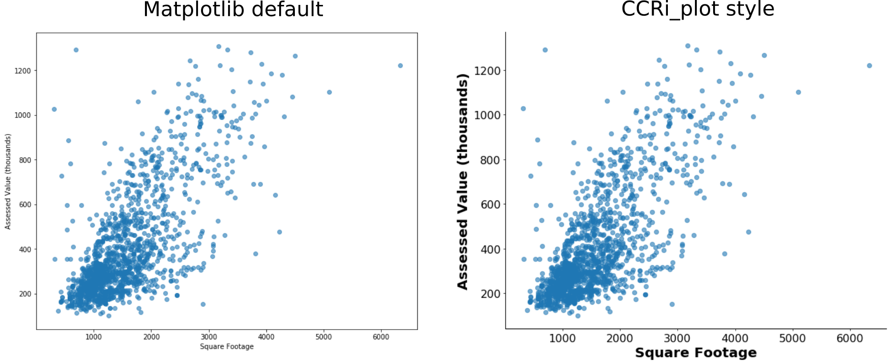
Unsurprisingly, the assessed value of a property increases as square footage increases. These simple scatter plots, however, don’t tell the whole story. The ccri_plot function plot_scatter2d can automatically color the points based on input labels. Passing in a list of neighborhoods corresponding to each property makes it clear that the relationship between assessed value and square footage likely has different parameters depending on the neighborhood itself.

Regression
We know from our initial data exploration that there is some relationship between assessed value, square footage, neighborhood, and, more likely than not, other unexplored factors of the data. How well can a regression model predict the assessed value of residential properties from these dataset features? To test this, we built a random forest regression model using the RandomForestRegressor function from scikit-learn, and then we visualized the results using our ccri_plot functions. After training the model on 85% of the data, we used the fitted model to predict the prices of the remaining 15%. With ccri_plot, we can use the plot_true_vs_pred function to easily visualize how well our regression model performs, while also automatically computing the coefficient of determination (R2). Below, compare the scatter plot generated in one line from plot_true_vs_pred to a scatter plot created by calling matplotlib directly, using their default settings.
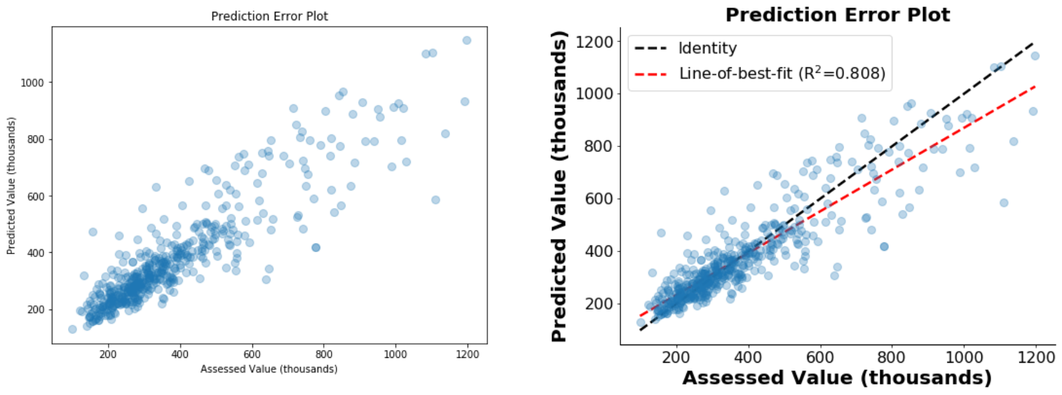
Compared to the matplotlib defaults, ccri_plot generates a figure that is easier to read from a distance and annotated with additional information. We can see that our regression model does a fairly good job of predicting the assessed values, both qualitatively as well as indicated by the R2 value of 0.8 (though our model tends to undervalue some of the higher-priced homes). What features of the data are actually contributing to the model’s predictive power? To help answer this, ccri_plot has a feature importance visualization function, plot_feature_importances, that produces a sorted and annotated bar plot of the feature importance values.
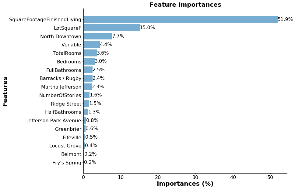
We can clearly see that the feature of the data that had the largest impact on the model’s predictions was livable square footage. We also see that being in certain neighborhoods, like North Downtown or Venable, had large effects on the predicted values.
Classification
To demonstrate additional ccri_plot capabilities, we flipped the problem around and, instead of trying to predict property value, we asked whether we can create a classifier that can accurately guess what neighborhood a given house is in. To keep things fair, we created a balanced dataset that includes the same number of properties from each neighborhood (300 each, excluding neighborhoods without enough data; the same procedure was performed in the regression section above). We fit a random forest classifier (RandomForestClassifier from scikit-learn) to 85% of the data, this time including assessed value as a feature, with the goal of predicting the correct neighborhood label. We then then tested the model on the held out 15%.
Here, we can use the ccri_plot function plot_confusion_matrix to quickly create a confusion matrix of the model predictions:
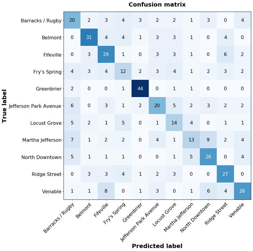
With this, we can see that the model does quite well at classifying homes in some neighborhoods, such as Greenbrier or Belmont, but worse for others, such as Fry’s Spring or Locust Grove. We can explore the model’s performance in a class-specific manner by using plot_roc_curve and plot_pr_curve to generate the receiver operating characteristic (ROC) and precision-recall curves, respectively.

Given just the true class labels and the predicted class labels, we’ve easily created figures that give us insight into how well the model is doing. The model can tell when a home is in Greenbrier, with very few false positives and high sensitivity. Not so for Fry’s Spring, where the model is performing above random chance, but its discriminative capabilities are clearly lower.
Plotting more plots
Facilitating good practices in data science is something that we care a lot about at GA-CCRi. The development of this plotting library helps us keep moving in that direction, allowing us to visualize data and model results in an attractive and easy to understand way. Going forward, we’ll continue to make this tool even better, expanding its capabilities and options to make it increasingly useful for our data scientists.