GeoMesa analytics in a Jupyter notebook
As described on its home page, “The Jupyter Notebook is a web application that allows you to create and share documents that contain live code, equations, visualizations and explanatory text. Uses include: data cleaning and transformation, numerical simulation, statistical modeling, machine learning and much more.” Once you install the open source Jupyter server on your machine, you can create notebooks, share them with others, and learn from notebooks created by others. (You can also learn from others’ notebooks without installing Jupyter locally if those notebooks are hosted on a shared server.) We at GA-CCRi have found Jupyter great for using GeoMesa to interactively explore of massive amounts of spatio-temporal data.
Below you can see a simple mix of formatted text and executable code in a short Jupyter notebook, and how code blocks can be tweaked, run in place, and build on previous code blocks.
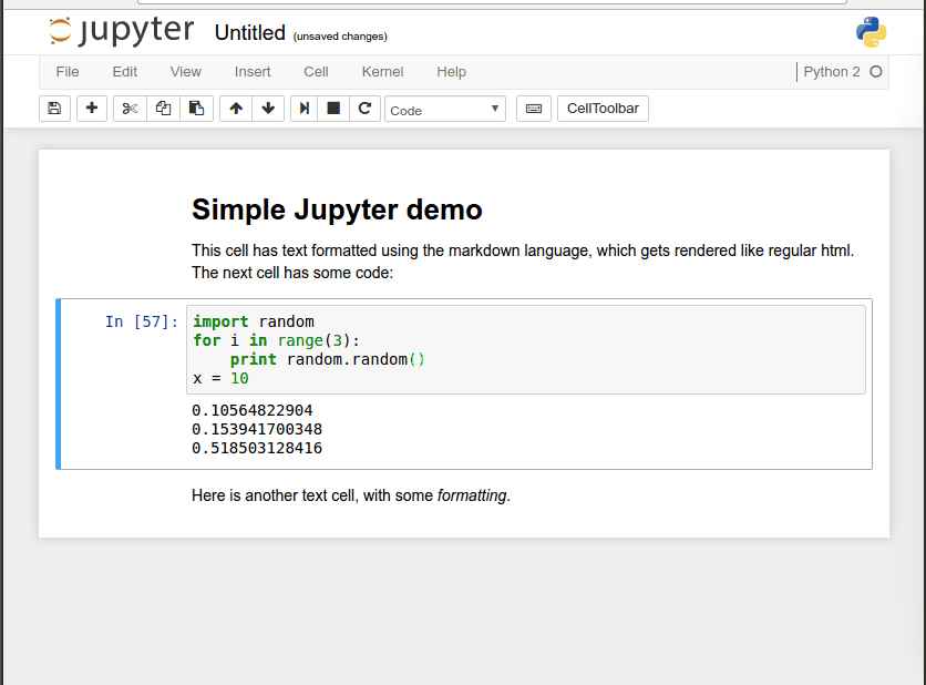
(Most of what you see the mouse doing above can be done more quickly through the use of shortcut keys.) This ability to build shareable narratives around executable code has made Jupyter popular for transmitting knowledge in the Data Science community, where many popular programming libraries are written in Python. In fact, Jupyter was originally called IPython Notebook and only supported that programming language, but now it supports over 40 of them.
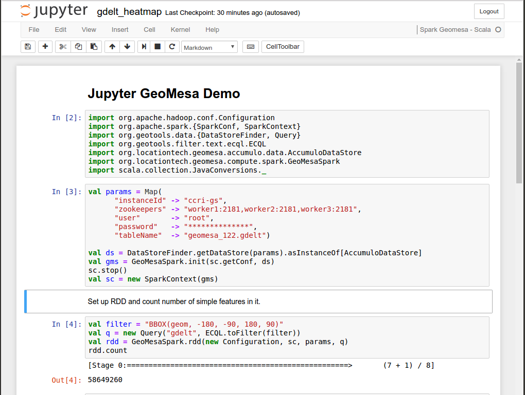
The GEOINT Services team at GA-CCRi has configured Jupyter to use the Scala programming language and the Apache Spark analytics framework with GeoMesa. Below you can see a notebook whose first cell imports some setup libraries and whose second cell defines a Spark context with a little Scala code. Below that, the third code block cell creates a Spark RDD (a “Resilient Distributed Dataset,” which Spark can distribute for execution across multiple nodes) and then counts the Simple Features of geographical data stored in that RDD.
Just as the execution of the little block of Python code in the notebook example above makes the output appear below it, execution of that third block makes the number 58649260 appear below that, telling us how many simple features are stored in this RDD.
This only scratches the surface of the kinds of geospatial analytics that you can do with GeoMesa and Spark. Spark also allows for parallelized grouping and reduction operations, letting you easily construct mappings from features to aggregate properties—for example, grouping events into bins based on the day they occurred. This aggregation can even span multiple data sets, aggregating properties of one based on a bin defined in another. Once constructed, these groupings provide quick insight into the density of your data. Reduction operations can further take advantage of the distributed nature of partitions to efficiently compute sums or other functions over a common key. For examples of how to do these kinds of tasks, see the GeoMesa documentation’s Spark tutorial shows more.
Jupyter also lets you generate graphics. Below we see an animated version of the same notebook, a few cells beneath the ones shown above. After a bit more setup, the cell with the import statements generates a heatmap of the world showing activity in current event news (using data from the GDELT project) and the cell after that displays the result.
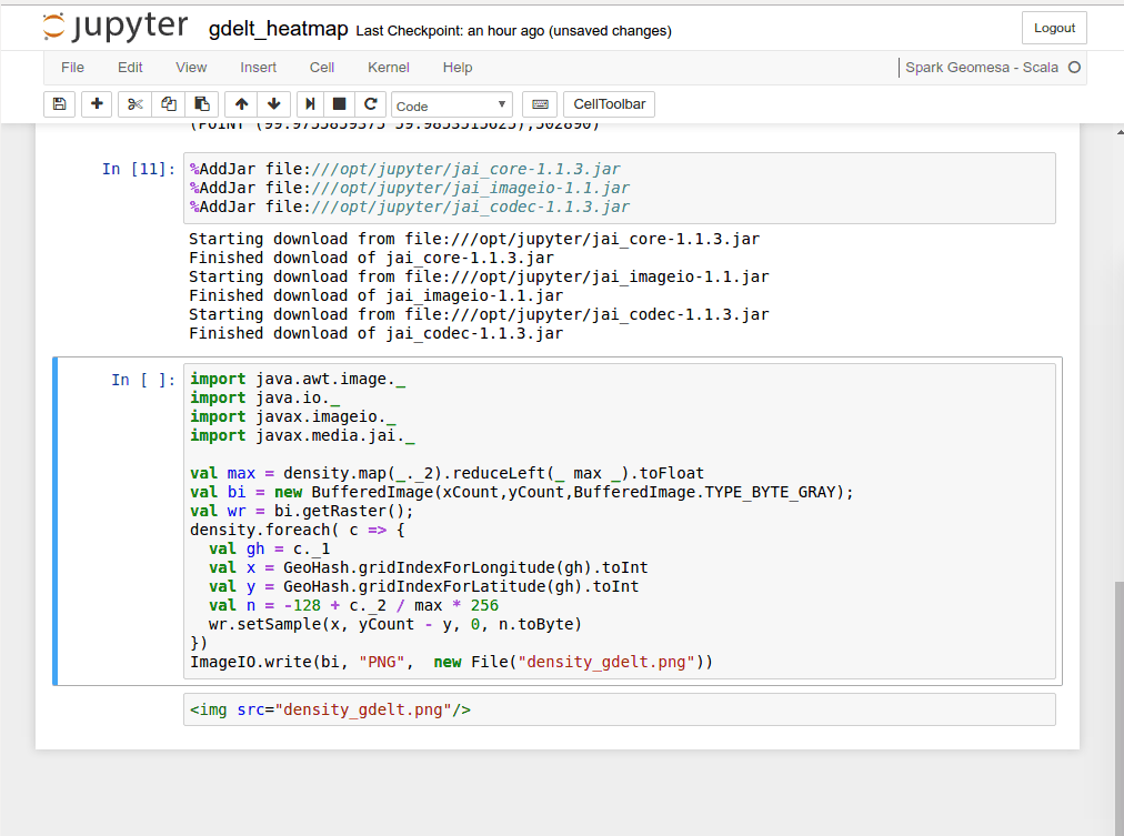
The calculations necessary to generate the image do not happen instantaneously. There’s a bit of work for the computer to do there, and while the code is executing you can see an asterisk replace the number in the square brackets to the left of the code block. When doing something like this in a production application, we have techniques to tune the underlying architecture around customer needs to improve performance.
If the above example’s resulting heatmap of social media activity looks suspiciously like a general map of world population, it’s not a coincidence; a very funny xkcd cartoon describes this phenomenon well. The setup code that generated it could have used more sophisticated conditions involving tools such as sentiment analysis—for example, using different colors to represent positive and negative interactions between entities mentioned in news articles. With the full Spark toolbox available, there are all kinds of textual and visual analytics that you can perform to get more value out of your spatio-temporal with GeoMesa, no matter how big your data collection is.